
You’re Mixing These UX Flows — That’s Why Your UX Feels Broken
Your UX isn’t broken—it’s incomplete. Ignoring task flow, user flow, and wireflow leads to confusion, friction, and users dropping off before completing key actions.
Introduction: Where UX Actually Breaks
Task flow. User flow. Wireflow. UI flow.
Most designers know these terms. Few use them correctly.
And that’s why UX breaks.
Flows don’t fail on their own. UX fails when you skip them, mix them, or use them in the wrong order.
You jump into UI. You design screens. But the logic underneath is missing.
So the interface looks fine—but the experience doesn’t work.
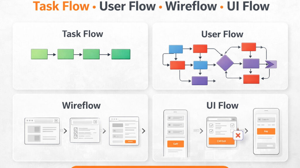
Task Flow — One Goal, One Direct Path
A task flow shows the exact steps needed to complete a single goal.
It is always linear, direct, and without branches.
Example: User wants to order food
- Open app
- Select restaurant
- Choose item
- Add to cart
- Checkout
- Pay
This is the shortest possible path. No variations. No decisions.
This kind of step-by-step breakdown is the foundation of task analysis, as explained by the Nielsen Norman Group.
If you want to go deeper into how task flows reduce friction and improve conversions, read this: Task Flow in UX Design: How to Simplify User Actions and Improve Conversion.
If this path is unclear, everything built on top becomes messy.
User Flow — Multiple Paths, Real Behavior
A user flow shows all the ways users might complete that same task.
Unlike task flow, it includes decisions, variations, and drop-offs.
Example (same food order):
- User logs in or continues as guest
- User searches or browses
- User applies coupon or skips
- Payment succeeds or fails
- User retries or exits
This is not one path—it’s multiple possible paths.
User flows focus on real user behavior rather than ideal paths, a concept explained by the Interaction Design Foundation.
If you want to understand how to design user flows that actually drive results, this breakdown helps: From Idea to Interface: How to Design a User Flow That Actually Converts.
If you skip this, you design for a perfect user that doesn’t exist.
Wireflow — How Everything Connects
Now you turn those steps and paths into a structure.
A wireflow shows:
- What screens exist
- How those screens connect
- What happens after each action
Example:
- Home → Restaurant list
- Restaurant → Menu
- Cart → Checkout
- Payment → Confirmation
This is where the system becomes visible.
Without this step, screens get designed in isolation—and the experience feels disconnected.
Skip this, and navigation breaks even if individual screens look fine.
UI Flow — How Interaction Actually Works
This is the final layer—what users interact with.
UI flow defines how each step behaves:
- Buttons trigger actions
- Forms collect input
- Error messages guide recovery
- Feedback confirms success
But here’s where most teams go wrong.
They try to fix UX problems at the UI level—when the real issue exists in earlier flows.
If this sounds familiar, this breakdown explains it well: Your SaaS Isn’t Broken. Your UX Is Quietly Killing Conversions.
UI does not fix UX problems—it exposes them.
What Happens When You Mix These Flows
This is where most UX breaks.
- You design UI before defining the task
- You skip user flow and assume behavior
- You build screens without structure
The result:
- Users get confused
- Journeys feel longer than necessary
- Users drop off before completing tasks
The problem isn’t UI—it’s missing flow logic.
Conclusion: Fix the Flow, Not the Screen
If your UX feels broken, don’t start with UI.
Start here:
- Is the task flow clear and direct?
- Does the user flow include real behavior?
- Is the structure defined before UI design?
If not, that’s where the problem begins.
Fix the flow—and the UX fixes itself.