
From Idea to Interface: How to Design a User Flow That Actually Converts
Most products don’t fail due to poor UI but because of flawed user flow design, and this guide shows how optimizing UX user flows improves conversion, reduces drop-offs, and drives real product outcomes.
Most digital products don’t fail because of bad UI.
They fail because the user flow was never designed properly.
It’s a subtle problem—but a critical one.
You’ve likely seen (or even built) products that look great: clean layouts, modern UI, smooth animations. And yet, users drop off. They don’t sign up, don’t complete actions, and rarely return.
Why?
Because somewhere between the idea and the interface, the flow breaks down.
In this guide, we’ll walk through a practical framework to design user flows that don’t just look good—but actually convert.
What Is a User Flow (And Why It Matters)
A user flow is the path a user takes to complete a goal in your product.
Think of it this way:
- User journey is the story
- User flow is the sequence of steps
These steps determine whether users understand what to do, feel confident doing it, and reach value quickly.
A beautiful UI can’t save a broken flow.
If users don’t know where to go, what to do, or what happens next, they leave—often without feedback.
Why Most User Flows Fail
1. Designing Screens Before Thinking
Teams often jump straight into tools—Figma, layouts, components—without first asking:
What is the user actually trying to achieve?
The result is not a cohesive experience, but a collection of disconnected screens.
2. Too Many Steps
Every additional step adds friction and increases drop-off.
Many flows look like this:
Landing → Signup → Verify email → Fill profile → Explore → Maybe understand value
This is not a user flow. It is a test of patience.
3. Delayed Value
Users don’t sign up to fill forms. They sign up to solve a problem.
If value is delayed, users lose interest quickly.
4. No Clear Next Step
When users ask, “What should I do next?”—the flow has already failed.
Confusion leads to abandonment.
Step 1: Define User Intent
Every effective user flow starts with one question:
What is the user trying to achieve?
Not what your product offers. Not what features exist. But the user’s real goal.
Focus on the Fastest Path to Value
- What is the core action?
- How quickly can users reach it?
Speed to value determines conversion.
Example:
- Wrong: Users browse menus
- Right: Users want to order food quickly
Step 2: Map the Task Flow
Once intent is clear, map the steps logically:
- Entry point
- Key actions
- Decision points
- End goal
Example:
Landing → Signup → Choose plan → Start using product
Then refine it by identifying hesitation points and potential drop-offs.
If your flow isn’t clear on paper, it won’t be clear in the interface.
Step 3: Identify Friction Points
Most conversion problems are caused by friction.
Common issues include:
- Too many input fields
- Requesting information too early
- Unclear actions or labels
- Lack of feedback after actions
Users avoid unnecessary thinking. When steps are unclear or overwhelming, they hesitate.
Every extra step increases the risk of drop-off.
Step 4: Simplify the Flow
The goal is not to add more—it is to remove what does not matter.
How to Simplify
- Remove unnecessary steps
- Delay non-essential inputs
- Combine related actions
Before:
Landing → Signup → Verify email → Fill profile → Dashboard
After:
Landing → Signup → See value instantly → Complete profile later
Users accept effort, but not effort without value.
Step 5: Translate Flow into Interface
Only after defining the flow should you move to UI.
Principles
- One screen, one action
- Clear and specific CTAs
- Visible progression
Each screen should clearly answer: What should I do next?
Good UI follows a clear flow—not the other way around.
Step 6: Design for Conversion
The goal is not just completion, but confidence.
Key Principles
- Show value early
- Reduce cognitive load
- Guide users with clarity
Important metrics to consider:
- Activation rate
- Completion rate
- Drop-off rate
- Time to value
Example
Before:
Landing → Signup → Dashboard (unclear)
After:
Landing → Signup → Guided first action → Immediate result
The difference lies in clarity, speed, and direction.
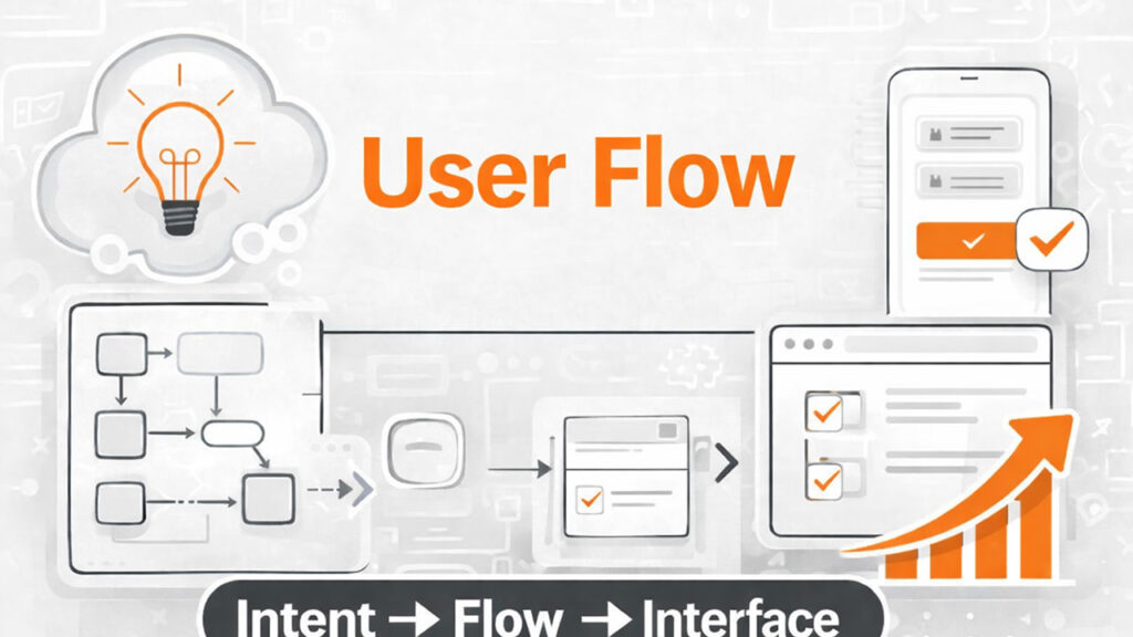
Framework
Intent → Flow → Interface
- Intent: What the user wants
- Flow: How they achieve it
- Interface: How it is presented
Most teams reverse this order, which leads to poor outcomes.
Conclusion
If your product looks polished but is not converting, the issue is likely not the UI.
It is the flow.
Clarity converts. Complexity reduces engagement.
Call to Action
- What is your user trying to achieve?
- How many steps does it take?
- Where might users drop off?
You may not need a redesign. You need a better flow.
If you want a second perspective, reviewing your user flow can reveal more opportunities than UI changes alone.