
Why Your Design Looks “Off” (Even When You Can’t Explain It)
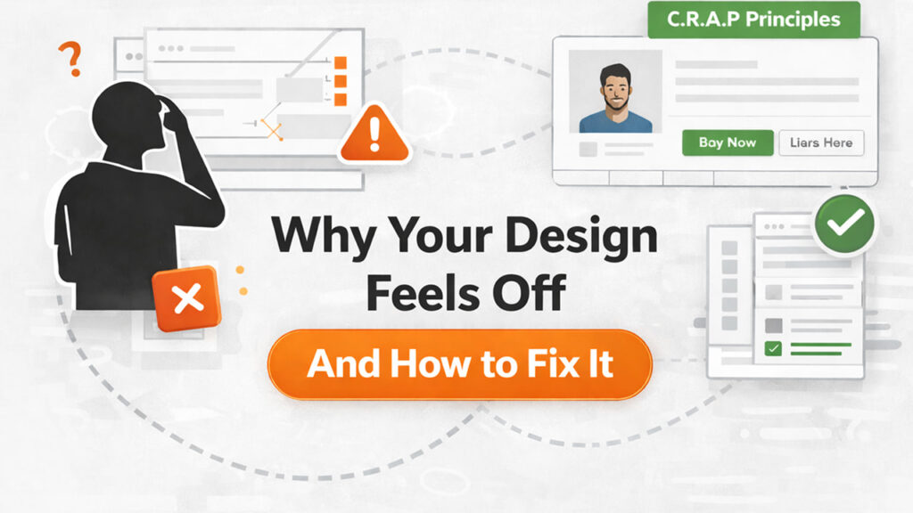
The Hidden Psychology Behind Bad UI (And How to Fix It Using C.R.A.P Principles)
Most designs don’t work as expected not because they look bad, but because they break invisible C.R.A.P principles—subtle structural mistakes your brain detects instantly, even when you can’t explain them.
Let’s break down why this happens—and how to fix it.
The Frustration Every Designer Knows
You tweak the colors. You adjust the fonts. You move things around… and still, something doesn’t feel right.
Not broken. Not ugly. Just wrong.
You stare at your screen, wondering: “Why does this design not work?”
If that sounds familiar, you’re not alone. Every designer reaches this point.
It’s not a creativity problem. It’s a structure problem.
Your brain detects visual inconsistencies instantly, often before you consciously notice them. That discomfort is your mind reacting to broken patterns.
In most cases, your design is violating four core principles: Contrast, Repetition, Alignment, and Proximity (C.R.A.P).
Fix these, and your design starts to work.
The Real Reason: Your Brain Detects Patterns Instantly
Design is not just visual—it is psychological.
The moment someone sees your interface, their brain scans for patterns within milliseconds. This determines how easily your design is understood.
When your layout lacks clear visual hierarchy, users must work harder to interpret it. This increases cognitive load and creates friction.
Think of walking into a messy room. You instantly sense something is wrong—even if you cannot explain why.
That is exactly how users experience poor UI design.
- No clear hierarchy → “Where do I look first?”
- Inconsistent spacing → “Why does this feel messy?”
- Poor grouping → “What belongs together?”
Have you ever seen a design that didn’t make sense, but you couldn’t explain why?
That is design psychology at work.
The 4 Silent Killers of Good Design (C.R.A.P Framework)
Most UI problems are not random—they follow patterns. They break these four principles.
Contrast: When Everything Competes, Nothing Leads
What it really means: Contrast creates hierarchy. It decides what users notice first, what they read next, and what action they take.
Problem: Lack of distinction between elements.
Result: Users cannot quickly identify priorities.
- Same font size for headings and body text
- Weak or low color differentiation
- Primary actions look similar to secondary ones
- Everything visually feels equal
Fix:
- Use size to differentiate importance
- Apply font weights intentionally
- Use strong color contrast for key actions
- Create spacing contrast between sections
Why it matters: Without contrast, users hesitate, miss key actions, and struggle to understand what matters—reducing clarity and conversion.
Common mistakes:
- Making everything bold or visually heavy
- Using too many competing colors
- Relying only on color instead of combining size and spacing
Quick fix: Increase heading size, reduce noise, and highlight primary actions clearly.
Repetition: Why Consistency Builds Trust
What it really means: Repetition creates familiarity. It ensures that patterns repeat across the interface so users don’t have to relearn.
Problem: Inconsistent styles and components.
- Different button styles across screens
- Uneven spacing between sections
- Multiple font styles without system
- Icons and UI elements not following a pattern
Fix:
- Reuse components and styles
- Maintain a consistent spacing system
- Limit typography variations
- Build reusable UI patterns
Why it matters: Consistency builds trust. Inconsistency creates friction and makes the product feel unreliable.
Common mistakes:
- Introducing new styles unnecessarily
- Inconsistent margins and padding
- Redesigning components repeatedly
Quick fix: Standardize components and spacing across the entire interface.
Alignment: The Structure Behind Clean Design
What it really means: Alignment organizes your layout. It creates invisible structure that makes everything feel intentional.
Problem: Lack of alignment.
- Elements slightly off-grid
- Text blocks not aligned
- Buttons and cards placed inconsistently
- Layouts that feel random
Fix:
- Use grid systems
- Align elements to shared edges
- Maintain consistent margins
- Avoid arbitrary placement
Why it matters: Misalignment makes interfaces harder to scan and reduces perceived quality.
Common mistakes:
- Center-aligning everything without structure
- Ignoring grids
- “Almost aligned” layouts
Quick fix: Snap everything to a grid and align consistently.
Proximity: How Grouping Creates Meaning
What it really means: Proximity defines relationships. It tells users what belongs together and what does not.
Problem: Poor grouping of elements.
- Random spacing
- Related elements placed far apart
- Unrelated items grouped together
- Cluttered layout
Fix:
- Group related elements closely
- Separate sections clearly
- Use spacing intentionally
Why it matters: Poor grouping increases cognitive load and slows down understanding.
Common mistakes:
- Equal spacing everywhere
- No clear grouping
- Overcrowded layouts
Quick fix: Cluster related items and increase spacing between sections.
Why This Matters in Real Products
Design that doesn’t work clearly affects user behavior and business outcomes.
- Users take longer to understand the interface
- Important actions get ignored
- Trust and credibility decrease
- Conversions drop
Good design reduces friction. Bad structure creates it.
Real Examples: Spot What’s Not Working
Imagine two UI screens.
Version A:
- Same font size everywhere
- Uneven spacing
- Misaligned buttons
Version B:
- Clear hierarchy
- Consistent spacing
- Clean alignment
Most users will prefer Version B instantly.
The difference is not creativity—it is structure.
Ask yourself: What’s not working here?
Before You Fix Your Design, Ask This
- What should users notice first?
- What action matters most?
- What belongs together?
- What can be removed?
Clarity starts with intention, not decoration.
The “20-Second Fix” Checklist
When something doesn’t work, evaluate it systematically.
- Copy: Is the message clear, concise, and aligned with the user’s intent and actions?
- Hierarchy: Is it obvious what users should see first, second, and next?
- Contrast: Are size, weight, color, and spacing guiding attention effectively?
- Color: Are colors used intentionally with clear roles?
- Typography: Are fonts readable and consistent?
- Spacing & Proximity: Are elements grouped and separated clearly?
- Alignment: Is the layout structured and aligned?
- Repetition: Are patterns consistent?
- Visuals: Do visuals support the content?
If even one of these breaks, your design loses clarity. If all work together, your design feels effortless.
Why Even Good Designers Miss This
Designers often focus on aesthetics but ignore structure.
- Trends
- Colors
- Visual polish
But overlook:
- Hierarchy
- Layout systems
- Structural clarity
Good design does not draw attention to itself. It simply works.
How to Train Your Eye
- Analyze great UI
- Fix bad UI
- Use systems
Break down structure, not just visuals.
Apply C.R.A.P principles to redesign.
Rely on grids, spacing, and patterns.
With practice, you will identify issues instantly.
Conclusion: Design Isn’t Broken—Your System Is
If your design doesn’t work, the problem is not creativity—it is structure.
- Your brain detects design flaws instantly
- Most issues come from broken fundamentals
- Fixing structure improves everything
Instead of asking, “Why does my design look bad?”, ask:
“Which principle am I breaking?”
You don’t need more creativity—you need a better system.
Structure is not decoration—it is how design communicates.