Task Flow in UX Design: How to Simplify User Actions and Improve Conversion
By simplifying user actions and removing friction, task flow in UX design improves clarity, speeds up task completion, and helps digital products achieve better usability and higher conversion rates.
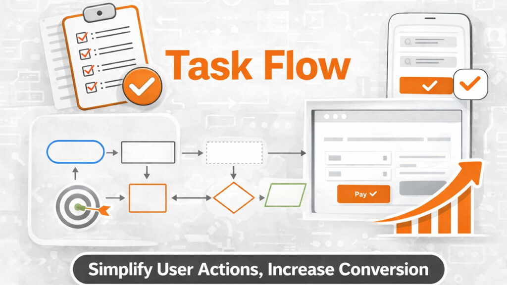
Most products don’t fail because users lack interest, but because completing simple tasks feels unnecessarily complicated, and this guide shows how designing effective task flows improves clarity, usability, and conversion.
What Is a Task Flow (And Why It Matters)
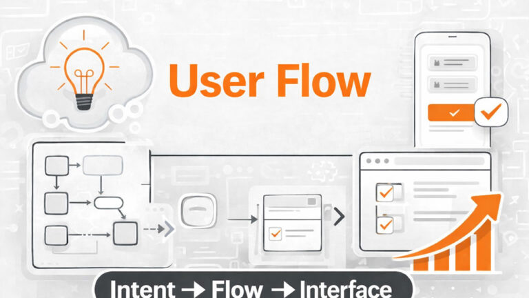
A task flow represents the exact steps a user takes to complete a single goal in your product, a concept closely related to user flow design as explained by
Interaction Design Foundation.
Unlike broader UX concepts, task flow is focused and specific. It answers one simple question:
How does a user complete this one task?
- User flow = multiple paths and scenarios
- Task flow = one clear path for one goal
This makes task flow one of the most practical tools in UX design. It directly impacts usability, efficiency, and conversion.
If a task feels difficult, users won’t complete it.
Why Task Flow Is Critical for Product Success
Every product depends on users completing tasks:
- Signing up
- Making a payment
- Booking a service
- Creating content
If these tasks are not smooth, the product fails—regardless of how good it looks.
Task flow directly affects:
- Conversion rates
- Drop-off rates
- User satisfaction
- Retention
A well-designed task flow removes friction and helps users move forward with confidence.
Task Flow vs User Flow: Key Difference
This is where many designers get confused.
User flow maps multiple paths a user can take.
For a broader view of how users move through a product across multiple paths, see user flow in UX design.
Task flow focuses on one specific path for one action.
Example:
- User flow: All possible ways a user interacts with an app
- Task flow: Steps to complete checkout
Task flow is more focused, actionable, and easier to optimize.
Why Most Task Flows Fail
1. Too Many Steps
Every extra step increases effort and reduces completion rates.
Example:
Login → Verify → Fill form → Confirm → Review → Submit
This creates unnecessary friction.
2. Asking Too Much, Too Early
Users are often asked for too much information before they see value.
This increases resistance and drop-offs.
3. Lack of Clear Direction
If users don’t know what to do next, they hesitate.
Hesitation breaks momentum.
4. Poor Feedback
Users need confirmation after every action.
Without feedback, they feel lost.
Step 1: Define the Core Task
Start with clarity.
Ask:
- What is the exact task?
- What does success look like?
Example:
- Bad: “User explores app”
- Good: “User completes checkout”
Be specific. Task flows only work when the goal is clearly defined.
Step 2: Identify the Simplest Path
Now map the most direct path from start to finish.
Focus on:
- Minimum steps
- Clear progression
- No unnecessary decisions
Example:
Product page → Add to cart → Checkout → Payment → Confirmation
The best task flow is the simplest one that still works.
Step 3: Remove Friction
Now optimize.
Look for:
- Repeated inputs
- Redundant steps
- Confusing actions
Reducing friction is closely tied to minimizing cognitive load, as users prefer simple and predictable interactions, a principle highlighted by
Nielsen Norman Group.
Then eliminate or simplify them.
Before:
Signup → Email verify → Login → Setup profile → Start
After:
Signup → Start → Verify later
Reduce effort wherever possible.
Step 4: Guide the User Clearly
Users should never feel lost.
Each step must clearly answer:
What should I do next?
Use:
- Clear buttons
- Progress indicators
- Helpful microcopy
Guidance increases confidence and completion rates.
Step 5: Provide Feedback and Confirmation
After every action, users need feedback.
Examples:
- Success messages
- Loading indicators
- Visual confirmations
Feedback reassures users and keeps them moving forward.
Step 6: Test and Improve the Flow
No task flow is perfect on the first attempt.
Observe:
- Where users drop off
- Where they hesitate
- Where they get confused
Then refine the flow continuously.
Real Example: Checkout Task Flow
Before:
Cart → Login → Address → Payment → Review → Confirm
Issues:
- Too many steps
- Forced login
- Delayed completion
After:
Cart → Address → Payment → Confirmation
- Optional login
- Fewer steps
- Faster completion
Simplification improves completion rates.
Best Practices for Task Flow Design
- Focus on one goal at a time
- Minimize steps
- Reduce user effort
- Guide clearly
- Provide feedback
- Test and iterate
These principles apply to every product, regardless of industry.
Conclusion
If users struggle to complete simple tasks, your product will struggle to grow.
Task flow design is not about adding features—it’s about removing friction.
Simplicity drives completion. Completion drives conversion.
Call to Action
- What is the most important task in your product?
- How many steps does it take to complete it?
- Where might users drop off?
Improving just one task flow can have a measurable impact on your product’s success.
Start there.